My preparation for outings benefits from knowing the recent weather history of remote locations. Remote forecasts are easy, but what actually happened?
This time of year, I’m most interested in snowfall and ice skating—a few inches of unexpected snow make ice hazards more difficult to identify. Visualcrossing.com serves remote weather history, and I’ll walk you through the application here.
What’s awesome about Visual Crossing: For remote locations, Visual Crossing provides an aggregate history based on the nearest weather stations. You can opt to include remote data (satellite/radar), which includes information about temperature, cloud and ground cover, and winds for any location on Earth, regardless of nearby weather stations.
What’s not awesome: For my specific use case, Visual Crossing doesn’t handle snow very well. Specifically, as far as I can tell, the snow parameters (depth, snow water equivalent) from the SNOTEL network aren’t available. This is a major shortcoming.
A case study
A friend shared news of three ice-related fatalities last week. My first thoughts were that seven inches (18 cm) of ice should have been more than enough for the loads. Then I used Visual Crossing to look at temperatures and solar radiation leading up to the incidents: absorbed radiation weakens the ice from within—thickness is no longer a good proxy for strength. Data from Visual Crossing is below: the dates of the fatalities are in red, and likely environmental factors are in orange—a night where it didn’t freeze and several days with high solar radiation.

Remote forecasts…
I use Windy.com for remote forecasts. Click anywhere on the map to reveal a ten-day forecast and model comparison. Cool stuff. If you aren’t familiar with Windy, this recorded webinar is a good place to start.

So … what actually happened?
Before introducing Visual Crossing, it is worth mentioning that Windy provides a seven-day weather history. The downside is that you don’t have much control over the reported parameters and associated metadata—this is particularly evident when trying to work with snow. Again, SNOTEL’s snow parameters aren’t included. Precipitation is reported for other stations, but a lack of metadata makes the values difficult to interpret. For example, what does a reported 0.02 inches of rain at 22 ºF really mean? I assume the 0.02 inches is snow water equivalent (which, with the 12:1 rule of thumb, might mean 0.24 inches of snow), but I’m making a lot of assumptions.
To access weather history with Windy, you first need to overlay weather station locations. Choose Reported wind or temp from the overlay menu, then click on the station of interest (you might need to add Reported wind/temp to the overlay menu list, as shown below).
Scroll over the timeline to view summary values. Limited station metadata is available at the far right.
One more sidenote … Windy has a really cool but subtle feature here: a comparison with what had been forecast. Click the Compare with forecast dropdown menu in the lower left corner. Green and red lights indicate good and poor matches, respectively.
Visual Crossing
If you want more than what Windy offers, check out Visual Crossing (VC). VC is a weather powerhouse that feeds data to various applications via an API and website. I’m using the Query Builder page, which provides seven days of daily summaries for free, or pay-as-you-go for deeper research. The pay-as-you-go rate feels very reasonable to me—my queries have cost pocket change so far.

The VC interface might feel intimidating at first. Here’s how I’d start.
Select the location, date range, and units

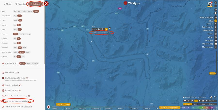
I’m working with remote locations, so I paste a lat/lon in the blue banner (upper left). Because I likely have a Windy.com window already open, I import lat/lon from Windy. From Windy, click on the hamburger icon in the upper left to access Settings, then choose weather picker contains lat, lon. Now, when you click on the map, you will see a clickable lat/lon that will be copied to the clipboard, ready to paste into VC.

Next, choose the date range. You will need to work with seven days or fewer to avoid paying. Units are controlled in the upper right.

Choose stations and data sources
VC can deliver historical station data, remote data (satellite/radar observations), and forecasts. It takes a few steps to define what you want.

Choose Data sections and then Historical station observations. Depending on your interests, you might want to select Historical remote observations (satellite, radar) as well. Remote observations include temperature, wind, cloud cover, etc., for any location on the globe. But I’m interested in on-the-ground observations, so I’m excluding remote data for now.

Next, click Stations from the Data Details category to view the lat/lon location (red) and the nearest stations for which VC has historical data (blue).

VC defaults to a 50 mile/km radius depending on your unit settings.
For this location, I’d prefer not to include the coastal stations because they typically have significantly different weather. There are several factors to consider here:
- VC combines data from all indicated stations.
- More weight is given to nearer stations. So, maybe it isn’t a big deal to include the coastal stations.
In theory, you can limit the station selection by defining the maximum radius from the point of interest, as well as the maximum number of stations. This isn’t working consistently for me, and I’ve submitted a bug report. But here’s how it should work:
Select Weather stations from the Query options list, then set the maximum distance and number of stations.

Close the window and click on the Daily weather data option:

Choose weather elements
If the default grid of weather observations feels overwhelming, you can choose to select the parameters of interest. But first, scroll to the right to view the stations. Note that each row is a combination of multiple stations. If you included the remote data source earlier, you would also see ‘remote‘ here.

To choose which parameters are listed, select the Weather elements link from Query options.


Note that if you still want to see a Stations column in the grid, you need to select Stations from the Weather Stations menu item.

You should now see a grid with your parameters of interest. Cool!

So, what’s not to love?
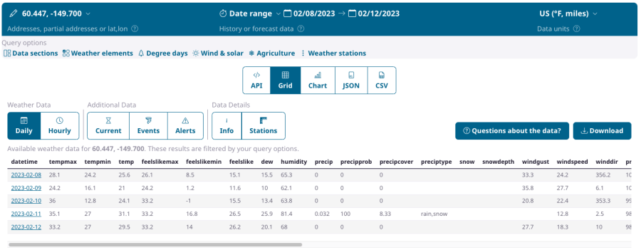
Visual Crossing is an awesome resource for researching historical weather. I appreciate that I can do a lot, and for free. But, I was really hoping to find the ultimate tool to evaluate snowfall, and this isn’t it. I get it … measuring snowfall is a challenging problem. A closer look at the precipitation parameters is revealing:

In this example, the precip values are coming from a single station 24 miles away, even though there is a closer SNOTEL station. Precipprob and preciptype are both forecast parameters and don’t really belong here (it is worth reviewing VC’s parameter documentation). Precipcover is actually pretty cool … this is the fraction of the 24-hour day that had precipitation. In this case, rain or snow fell for about 120 and 60 minutes on the 11th and 12th. I like this information—it tells me whether it was a day-long drizzle or a shorter pulse of precipitation. Finally, snow and snowdepth don’t have any values, even though this data is available from SNOTEL (stay tuned for an upcoming post about SNOTEL).
PS. One more cool feature…
You can look up the weather history for an individual station.
Hover over the map to identify the station of interest, and note (copy) the station ID from the table.

Paste this ID in the location box to view the weather history for that station.


1 Comment